Monday, October 21, 2019

End of MP 1 Blog Post

Intention Definition & Exploration Ideas
Throughout the first marking period I wanted to toy with idea of using themes and possibly start to create some kind of story with it. What I decided to come up with is a story with the theme of chosen by destiny. I wanted to see how well I would do with creating a mini story with a theme given to it. The idea was that he would be chosen by destiny to protect his town from some monster attacking it. Besides this another thing I have taken interest is working on editing the digital set for cvtv and set it up for holidays like Halloween,Christmas,new years etc.

Planning
Through the course of the marking period I have worked on some pieces for it so far. The idea I had for the enemy was some sort of skeleton warrior that the main character would fight. I haven't had a chance to work on the set yet but when I do i'll have to figure out how to use blender 2.8 since it's a more recent file than what I do most of my work on now which is the blender 2.7 version. I am still debating on whether I wan't the characters as low poly or not but it's something I have to experiment with while moving forward with this project.

Producing
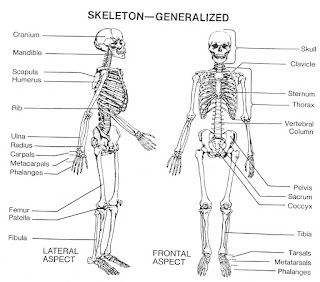
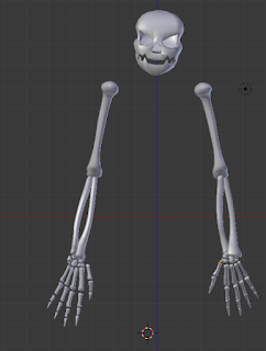
I attempted to make skeleton parts from a reference image,mostly the parts that would stick out of the body such as the arms and head. After making it I thought I would test what it would look in a body and since it's close to Halloween I decided to make a orange version with a hat. I also tried to get ideas for the town and I what I decided to go for is a sort of midevil town. I liked the idea of it being a sort of folk tale so I decided for it to feel like taking place in the past.


Medieval Town Map

Evaluating
I feel I have my ideas in place I just have to start working on producing the setting and characters that will be in the story itself. The skeleton work for the enemy is done I just need to create a body for said skeleton. Since I haven't done something like that before it was fun and interesting on creating a skeleton since its a bit different then just creating a person or object. My time management is something I have to work on when doing a project like this which takes up some time to work on.

Integrating
From doing this it has really required me to practice with things I may not be that comfortable with such as creating something from a reference image. It allows me to practice with being creative and trying to implement my thoughts into what I am trying to make, which sounds easy on paper but a lot harder in practice. Overall doing this has let me polish skills I have been using for blender and try out some new ways of using blender that let me make more detailed and better objects.

Text and Image Investigation

Text and Image is a very important part of art. We use it in almost all of art and comes in many shapes and forms. Some artists go around the world just to express their text and image and each one chooses their specific way they want to express this. One of these artists who uses a unique way to express this is the artist Banksy. Banksy isn't really a artist who is known for their paintings or sculptures, rather he is known for his street art. It's not like hes lost relevance over the years either, his art is still strong with him putting his art all over the world.

Image result for Banksy
https://www.sothebys.com/en/artists/banksy

His art is heavy on image which can make them pretty recognizable. However since it is street art it is considered by the government as graffiti so it will usually not have a long life span,especially if it is in a popular area. While he mainly does just imaged based works he may also leave a message with his work relating to it in some way. With these works he never tells or explains the meaning of what he means with these, but rather lets the viewer decide on what they think it means. An example of this is of the picture below. Last year in January he made this work on the permanently raised bridge on Scoot Street in the Wincolmlee area of the city. He posted this work not long after people found it and many wondered what this was supposed to mean. Many people speculated is had to do with the Brexit situation at the time but they were never given a clear answer. Overall when Banksy uses text and image he mostly uses the image part of that where he makes a very detailed art that brings intrigue to those who come across it.

A close-up of the design
https://www.bbc.com/news/uk-england-humber-42841320
From Banksy's work I've learned a few things on how you can use text and image in your art. You don't have to give a clear statement as what it should be but rather what you think it should mean/stand for. That you can make intriguing art that doesn't give you all the pieces but still compel people to be interested in what you do and how you do it. I feel a lot of contemporary art uses this kind of idea. When you look at a lot of professional being created,to me at least, you aren't really told a lot about it, but are given a feeling about what you think it means. Of course each contemporary artwork that you come across can be different than the previous in more ways in one but they all come down to an idea that they are trying to convey one way or another.

Layering Investigation


Related image
https://www.kcrw.com/culture/shows/art-talk/murakami-at-gagosian


Related image
https://blaira19-project.bus321.wlu.edu/about-takashi/
Im very interested in artist's who use layering a lot in their work. It can bring a lot of ideas into one piece and make it very interesting with what they do with it. One artist that was gone over that really caught my eye was an artist by the name of Takashi Murakami. Besides the fact that his art is very colorful, what really caught my eye is his art style and how he uses it in his layering artworks. What a lot of people may know this artist by is his signature flower design,which you can see depicted in the picture, and a mouse head design. Looking at some of the works he has created can just put you in awe with the amount of things going on. Looking at these artworks your eyes never stay in one place for long as you look all over the piece with details going on all over the place as shown in the picture above. Even though in these works of art he uses a huge mix of colors nothing is an eye-sore or just hurts the eyes to look at it just all mixes together which I feel adds more to this work of art. The way he uses layering in pieces like this boggles the mind with how complex it is with colors just coming out of other colors and shapes mixing and bending with others to create a sort of seamless piece. To differentiate from the mess of colors Takashi uses outlines so that pieces that are not meant to overlap don't look like they do. With the use of this creates a great piece of layering with outlines to show parts on top of each other stacking into a point where it just all comes together. Since he uses a lot of colors in this piece he mainly uses white to make things pop out such as the heads where the mess of colors come out of. However he can use this technique in the opposite way. In this down below he uses layering to differentiate the different colors of the demons making them pop out in their own way. He puts the red demon over a background that contrasts with what color he is making him pop out, he does the same thing for the blue demon. Doing so makes them the first thing you look at because your eyes are drawn to things that pop out rather than colors that don't. This would be a reason why you wouldn't notice the people at first or the fact that they look different they don't pop out as much as the demons. Overall Takashi Murakami uses layering to give his works a lot of detail with so many contrasting colors that it immediately grabs your attention and then after doing so you spend so much time looking at these works from all the different layering going on with no two things next to each other looking the same.
Red Demon And Blue Demon With 48 Arhats 2013 Limited Edition Print by Takashi Murakami
https://www.artbrokerage.com/Takashi-Murakami/Red-Demon-And-Blue-Demon-With-48-Arhats-2013-70918


From looking into Takashi Murakami I feel I learned some interesting ways to incorporate layering
 and ways you can use it to grab people attention. We know that conflicting colors make them pop out but when you look at Takashi's work he takes that idea and runs with it creating this interesting piece of art and I hope to use this kind of idea when I plan on making scenes or objects themselves. I love the idea of messing with colors in a way that maybe the viewer didn't expect or is intrigued on how it looks with varying color contrasts. I feel that contemporary art uses layering a lot,maybe not to the degree that Takashi does, but enough where shows a separation in the piece. Of course each artist uses layering to a varying degree but the idea of it is still there whether its used a little or a lot. One contemporary artist where you can see layering used is Ronald Ventura with one of his works down below.

Hybridity Investigation

Image result for chris doyle artist
https://zerogravity.empac.rpi.edu/doyle/

 While at first glance hybridity may seem the same as layering they are in fact VERY different from each other. An artist who I found expresses hybridity well is artist Chris Doyle. Hybridity simply is the use and combinations of different art forms used all in one piece. A lot of Chris's uses this art theme a lot in his works of and above is an example of one of his works. The artwork above uses multiple different styles split into five sections which makes it appear as five artworks merged into one. This is the general idea of hybridity and is a tool a lot of artists use still in modern art. Besides still paintings, Chris Doyle is also known for his motion picture artwork which combines different artworks each one looking different than the last. One of his more popular ones is one called "Hallow and Swell" where in it it takes you through a sort of adventure through different arts and when it does so it appears to switch its style making it look different each time it changes. One other piece of work that caught my eye is the one below that shows black strands connecting to a midpoint with conflicting lines and squares in the background. He uses this idea in most of his work incorporating hybridity in some way to really intrigue the viewer. Overall hybridity is a very useful tool that artists can use to spice up their works to varying degrees.

From looking into Chris Doyle showed me some really interesting ways to incorporate hybridity and make it look well. From making this (late) blog post it definitely helped me more understand hybridity more and how you would use it when you would incorporate it. Even though however I am not too sure how I would incorporate it into the things that I work on, but I want to at least try to come up with one way of how I can do so and see if it's something I can incorporate it into further projects I work on. I would definitely look into it more with other contemporary artists and how they implement and use hybridity. One example of contemporary hybrid art is a painting with many shapes or style of shape all put together with different colors.

Image result for chris doyle artist
https://brooklynyouthchorus.org/events/the-lightening-at-wave-hill/
Image result for contemporary art hybridity
https://www.dazeddigital.com/artsandculture/article/15085/1/hybridity-in-new-art

Sunday, October 20, 2019

Themes in Conceptual Film


HEAVENS GATE
https://aleteia.org/2017/11/01/why-is-heaven-pictured-as-a-big-fluffy-city-in-the-clouds/
Themes in art are a very important thing in art, a lot of artists uses theme to create their work. I have been given an opportunity to look at a good of amount of different themes to see which interest me the most. One of these themes that caught my attention was The Sacred Realm. The picture above is a depiction of The Sacred Realm. It is a common idea that The Sacred Realm or Heaven is a place above the clouds and there is often a gate into said sacred place. The idea of what happens to us after we die and what is its purpose for us to serve after we leave the land of the living. Although with this theme i'm not really interested in art depicting churches and such but rather the idea of faith and the afterlife with that faith. There are a lot of different cultures that each have their own interpretation with christianity and islam being the two well known examples.
The other theme that seemed to interest me was Looking Inward: The Human Experience. This theme is all about how even though we all have different experiences all throughout the world we all experience the same feelings no matter where you are, it's just human nature. No matter where you grow up you experience grief, happiness, fear, curiosity ect. Besides this another thing behind this theme is the idea of talking to someone that is no longer with us. The idea of seeking guidance from someone who has already gone through your problem but it is just impossible to even reach to them anymore.

Image result for skyrim daedric gods
Add captionhttps://lhersheymodels.blogspot.com/2019/10/themes-in-conceptual-film.html

Besides these two themes there was one more throughout the list interested me and it is called Stories and Histories. This theme is all about stories throughout time from all over the world from folktales to religion. What about this interests me is that there are a ton of stories all throughout time fake and real and you can do a lot with that kind of material. To me im most fascinated with stories about mythical creatures such as the Wendigo and stories about journeys that try to explain the natural things through nature such as the greek stories and their gods. Some people even create entire lore around there game or story which can be fascinating in their own regards.

Overall these were the themes that interested me the most on what I could do with them I would probably mostly be going into Stories and Histories since that one interests me the most out of all of them

Sunday, October 6, 2019

Investigation 3

Over the course of this week I made a weapon for the story which is a type a spear and I did some more brainstorming of ideas for enemy of story. The weapon itself is from a show and my goal was to make it look similar to what it originally looked like. I liked how it turned out and i'll see how it looks with the scene when its put together. With my other spent time after I finished the weapon is what the enemy that the main character would face.
https://www.pinterest.co.uk/pin/548876273333451354
https://quarkmaster.tumblr.com/post/174137012476/rusty-symbol-of-the-art-contest-eternal-%D1%81%D0%B8%D0%BC%D0%B2%D0%BE%D0%BB


What I came up with was some kind of undead soldier. It would be a dead knight favored by the village who has came back to life to destroy it. I liked the idea of this type of enemy so I hope I can do my best to create a model like this, I just have to do some research on things like making a skull and such. Other than that I think its a great addition to the overall story and i'll see where it takes me from here.

Work Log
Monday:Worked on weapon
Tuesday:Worked on weapon
Wednesday:Worked on weapon
Thursday: Brainstormed enemy ideas
Friday: Attempted to start enemy

Late Blogpost 2

Semi-recently I had attempted to enter a contest to be an accessory creator. The task was to create two accessories that took up two differe...