 |
| https://www.kcrw.com/culture/shows/art-talk/murakami-at-gagosian |
 |
| https://blaira19-project.bus321.wlu.edu/about-takashi/ |
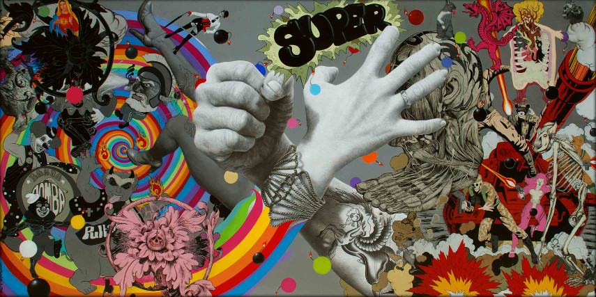
Im very interested in artist's who use layering a lot in their work. It can bring a lot of ideas into one piece and make it very interesting with what they do with it. One artist that was gone over that really caught my eye was an artist by the name of Takashi Murakami. Besides the fact that his art is very colorful, what really caught my eye is his art style and how he uses it in his layering artworks. What a lot of people may know this artist by is his signature flower design,which you can see depicted in the picture, and a mouse head design. Looking at some of the works he has created can just put you in awe with the amount of things going on. Looking at these artworks your eyes never stay in one place for long as you look all over the piece with details going on all over the place as shown in the picture above. Even though in these works of art he uses a huge mix of colors nothing is an eye-sore or just hurts the eyes to look at it just all mixes together which I feel adds more to this work of art. The way he uses layering in pieces like this boggles the mind with how complex it is with colors just coming out of other colors and shapes mixing and bending with others to create a sort of seamless piece. To differentiate from the mess of colors Takashi uses outlines so that pieces that are not meant to overlap don't look like they do. With the use of this creates a great piece of layering with outlines to show parts on top of each other stacking into a point where it just all comes together. Since he uses a lot of colors in this piece he mainly uses white to make things pop out such as the heads where the mess of colors come out of. However he can use this technique in the opposite way. In this down below he uses layering to differentiate the different colors of the demons making them pop out in their own way. He puts the red demon over a background that contrasts with what color he is making him pop out, he does the same thing for the blue demon. Doing so makes them the first thing you look at because your eyes are drawn to things that pop out rather than colors that don't. This would be a reason why you wouldn't notice the people at first or the fact that they look different they don't pop out as much as the demons. Overall Takashi Murakami uses layering to give his works a lot of detail with so many contrasting colors that it immediately grabs your attention and then after doing so you spend so much time looking at these works from all the different layering going on with no two things next to each other looking the same.
 |
| https://www.artbrokerage.com/Takashi-Murakami/Red-Demon-And-Blue-Demon-With-48-Arhats-2013-70918 |
From looking into Takashi Murakami I feel I learned some interesting ways to incorporate layering
and ways you can use it to grab people attention. We know that conflicting colors make them pop out but when you look at Takashi's work he takes that idea and runs with it creating this interesting piece of art and I hope to use this kind of idea when I plan on making scenes or objects themselves. I love the idea of messing with colors in a way that maybe the viewer didn't expect or is intrigued on how it looks with varying color contrasts. I feel that contemporary art uses layering a lot,maybe not to the degree that Takashi does, but enough where shows a separation in the piece. Of course each artist uses layering to a varying degree but the idea of it is still there whether its used a little or a lot. One contemporary artist where you can see layering used is Ronald Ventura with one of his works down below.


No comments:
Post a Comment